Main Font
Typography plays one of the most important roles in branding; it communicates most of the look and feel.
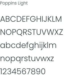
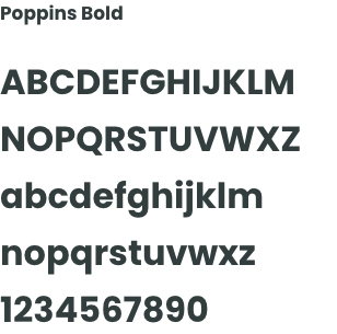
Poppins is a modern font with a large number of styles to use in our communications.
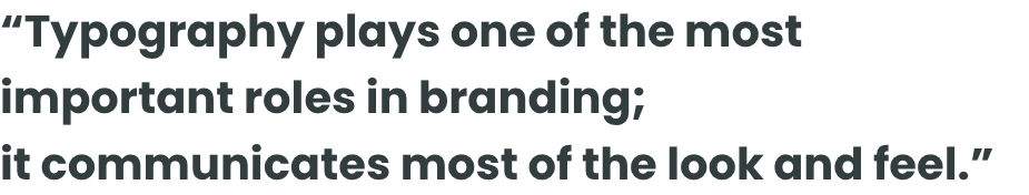
Typography plays one of the most important roles in branding; it communicates most of the look and feel.
Poppins is a modern font with a large number of styles to use in our communications.
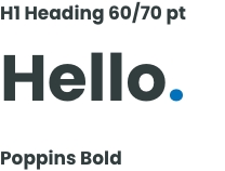
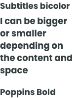
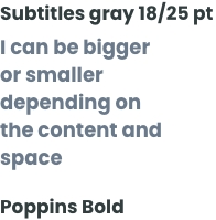
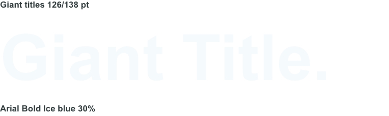
Keep the choice of font as simple and clear as possible. Poppins Bold is our preference. We like it big, bold and straight to the point to reinforce the feeling of the solidity and security.
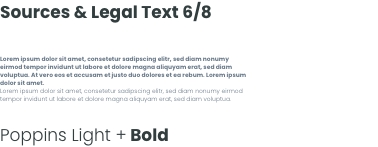
NB: Depending on the space and content, feel free to adapt font sizes, but aim to keep a feeling of space. It should look clear and minimalist, avoiding clutter.
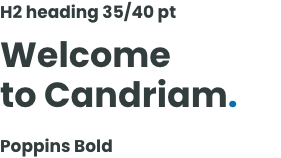

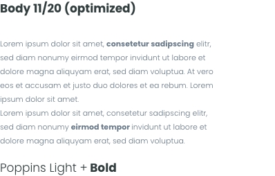
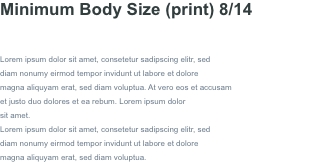
NB: The type size and leading will depend on the general layout of the document. However, please be consistent and not do change it from one page to another.

You want to make a classic Word, PowerPoint or other document? Don’t have the official Poppins font?
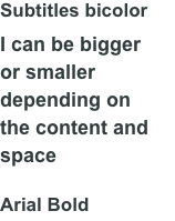
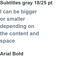
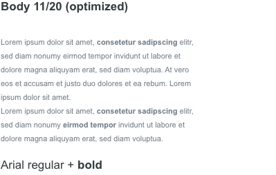
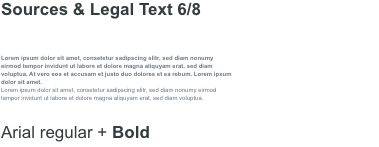
No problem. You can apply all of these guidelines with Arial. Be careful, however, not to distort the font. Never use capitals except for footnotes and for the date (see cover and footer).
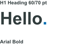
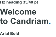
We can use a blue dot as a motif in our typography. This is suitable only for main titles or H1 headings. It gives rhythm, a sense of conviction and incorporates Candriam Dark blue. Use it sparingly for maximum effect.
Don’t use it on the cover.